Why should I focus on a Mobile-First website?
Remember: What is Mobile-First?A Mobile-First website means designing an online experience for mobile devices before designing it for desktop.
Firstly when we’re talking about Mobile-First, remember that it isn’t the same as a responsive design website (these two are often mixed up). Mobile-First is creating a separate website specifically for mobiles whereas responsive design is about making your website fit on different sized screens, for example making sure your site is correctly displayed on a desktop computer as well as on a tablet.
It’s now as important as ever for you to have a mobile first website and here are 5 reasons why:
1. It has become standard practice
Follow the crowd on this one.
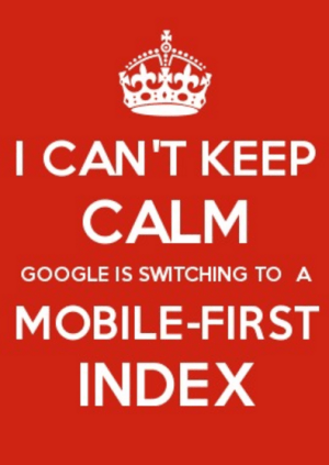
Forget the days of desktop version websites being the priority for Google and say hello to Mobile-First. Back in March 2018 Google Webmaster officially rolled out mobile indexing where the search engine decided to index websites based on their mobile versions and no longer on the desktop versions. This was put in place to keep-up with the ever-changing behavior of internet searchers whose move towards searching on smartphones was becoming something Google could no longer ignore.
REMEMBER
- As of March 2018 Google rolled out mobile indexing
- Google could no longer ignore the increased use of mobile searching
2. It can affect your SEO
Don’t kiss your Google rankings goodbye!
You invested time and effort into optimizing your desktop version and then boom, Google drops the Mobile-First bombshell! 😮 And I’m sorry to say but if you’re not thinking mobile-first then you’ll probably see a drop in your rankings as Google now penalizes websites that aren’t optimized for smartphones or tablets. When you’re creating your mobile website remember to check the following aspects:
-
Content
Both versions must include the same high-quality content. This means any text, images or videos originally on your desktop site. -
Structured Data
The structured data markup should be the same for both websites and you need to make sure it’s relevant to each specific piece of information. Luckily for you, you can test your structured data markup here. -
Metadata
The metadata doesn’t have to be identical but needs to include the same information and keywords. -
Robots.txt file
Check that the Google robots can still access your mobile website and access the same things as on the desktop site. This reduces the risk of having content on the mobile website indexed when it shouldn’t be.
My final point here (promise!) is that a mobile search doesn’t provide the same results as a Google search from a desktop. Research carried out showed that 79% of listings (over 25 million keywords analyzed) have a different rank on mobile and desktop services, so it’s important that when you’ve created your mobile website to regularly check your SEO positions. Keywords that rank well on your desktop site might rank differently for your mobile site.
(Spoiler alert: if you’re wondering what tool can analyze your keywords on Google mobile, Cocolyze might be able to help you  ).
).
REMEMBER
- Google penalizes websites that aren’t optimized for smartphones or tablets
- Check your content, structured data, metadata and robots.txt are in line with the desktop site
- Check your SEO positions on mobile
- Google mobile doesn’t provide the same results as Google Search
3. The potential of more reach
It’s like reaching for that last biscuit…’just-got-to-stretch-a-bit-more’…
With 60% of searches now from mobile devices, you need to be Mobile-First to reach more of your audience. Online users are grabbing their smartphone devices more than ever, as with their on-the-go lifestyle they want to get information fast. They’re goal-oriented; looking for an answer to their search query, fast. This is why having an optimized mobile site can provide you more reach because your content is adapted to the device they’re searching on.
These days lots of people check their emails from their smartphones because of the ease of accessing a mobile instead of a PC. From a business’ perspective this is a great opportunity to reach a wider audience because consumers are opening their emails (59% in fact) and clicking on email links more often now from their mobile devices. This is why having a mobile website is essential in reaching out to this audience if you’re sending emails with links to your website. The mobile experience of your website should be just as good the desktop experience.
REMEMBER
- 60% of searches are carried out on mobile devices
- Majority of users read emails from their mobiles and so visit websites from the links on their smartphones
4. It builds-up your credibility and reputation
You are the next Beyoncé of the internet!
Taking a mobile-first approach is all about having that welcoming smile and perfect, firm handshake for your future customers to say ‘yes, I’d love to do business with you!’ (cause let’s be honest, nothing’s worse than a limp handshake 😶). With the shift towards mobile search becoming more and more predominant a mobile website shows that your business is meeting the changing needs and demands of internet searchers, therefore building-up a more credible online presence. For example if you were doing a mobile search for the NFL website, which version of site would you say was more credible and trustworthy?
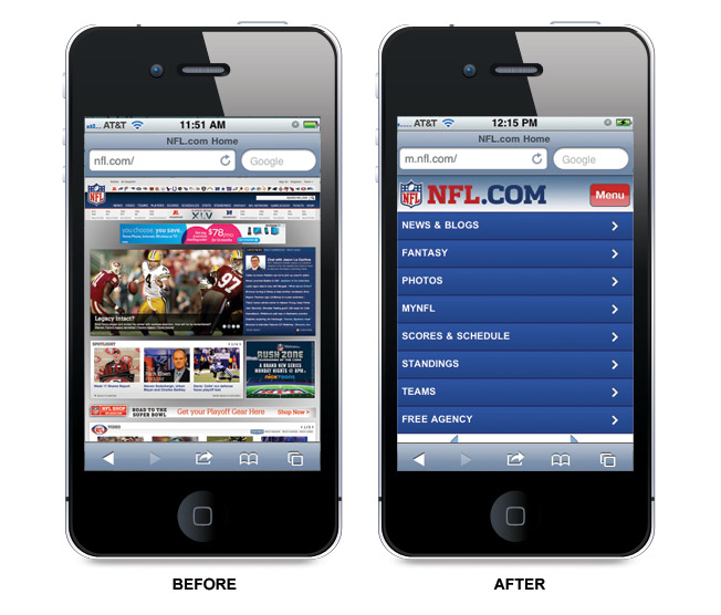
Although NFL is very well-known the visual representation of a website makes all the difference for users of their decision to continue using the site or not.
A mobile website that is well-optimized for the search engines makes you relevant and contemporary and in-line with todays search world demands.
REMEMBER
- Being Mobile-First reassures users that you have a credible online presence for internet shoppers
- It shows that your business is relevant and contemporary
5. Improves the overall user experience
You shouldn’t have to explain yourself.
If a user has had a positive experience with a site then they’re more likely to remember it and spread the word to their entourage. That said, users will also remember sites that they’ve had a bad experience with… That is why your priority as a business should be to create a great user experience on whatever device your users access your site.
Mobile users expect a fast response to their search query whether that be an online site with knee-length dresses or an answer to ‘how many different shades of blue are there?’ This is why a mobile website makes you focus on the content that is absolutely necessary to be included on your website. This is the content that mobile searchers are looking for without the ‘fluffy’ bits of information that they don’t need to see. For example, it’s easier the scroll down a page using a desktop whereas on a mobile device it isn’t as easy to handle. So think about chunking content together for a mobile site.
By focusing on the more relevant content, your mobile site will load quicker as the weight of the page to load is lighter… great for users and Google, both who love fast-loading pages.
REMEMBER
- Being Mobile-First lets you focus on what is absolutely necessary to be on your website
- Mobile sites load faster due to fewer information to load
- Mobile users expect a fast response to their search request
- People remember sites that they had a good experience with
Conclusion
Your audience is your most important asset so taking on the Mobile-First approach can no longer be ignored as your business needs to keep-up with your customer’s needs and behavior. Don’t miss out on any opportunity to reach your audience!
 by ,
by ,