8 golden rules for a brilliant homepage!
Your website’s homepage is a bit like the front window of a shop. We stop in front of it and take a peak. If it looks good we’ll go inside to discover more and if it doesn’t, then we’ll move onto the next shop window.
A homepage must make a visitor’s mouth water. You can optimize it with the following advice:
1. The first impression is important
The 3 most decisive seconds (of your life)
The majority of time visitors land on your page from an organic search in search engines from a request they typed in themselves (Hello Google and other search engines which complicate simplify our life). It’s really easy for them to move from one site to another. If they don’t like the site or if they don’t find the information they want they’ll go elsewhere to find what they’re looking for…the competition 😈.
Make sure that your page is clear and readable with a good design…a good design helps!
The reader must be able to easily understand what you do, and where to go or click in a blink of an eye. Your page must reflect your business and be adapted to your target market. Change the design and the position of elements depending on the age, tastes and habits of your visitors.
Be careful though! With your homepage design remember to take into account cultural differences. Look at the example below with the Rakunten Japan page and the Price Minister-Rakunten France page.
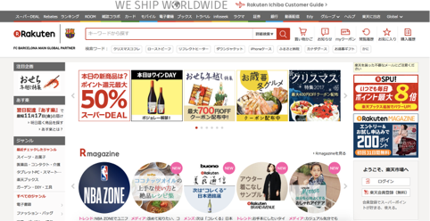
On the Japanese version there is a vast amount of information, there are offers everywhere and categories in abundance.
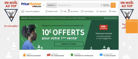
Here on the French page you can see that the design is simple with very few categories.
REMEMBER
- Your homepage must be clear and simple
- Your visitors must understand your activity and values
- Take into account cultural differences
- Be careful with your design
2. Optimize the loading time
Your visitors will not be patient
This piece of advice links directly with n°1 but I decided to make an extra point out of it as this is often just put to one side.
When I type “12cm pink heels with small princess bows“ into a search engine I almost instantly click on the first link in Google’s results page. If this page takes longer than 3 seconds to load then I’ll go directly onto another site and this will be the same for the majority of your visitors. In addition, with Google's Core Web Vitals integration, it is essential that the load time of the largest element of your page (the "LCP") does not exceed 2.5 seconds! Otherwise, the search engine may penalize you.
Optimize the loading time of your page following this non-exhaustive list of improvements:
- Optimize images by compressing their size: https://compressor.io
- Activate the browser’s caching: this lets the browser to temporary stock images so it doesn’t have to load them every time a visitor returns to your site.
- Check the site’s speed: some servers and technical configurations can heavily slow down the loading time.
REMEMBER
- Your page must be fully loaded in 3 seconds
- Optimize the loading of images
3. Structure the navigation
Category 28, page 52, line 36
Amazon has x amount of pages so it’s a bit difficult to find them all! A clear and well-structured menu allows visitors to quickly understand the ensemble of the site and to access it easily. Create enough categories to divide up the pages but don’t create too many at the risk of your visitors getting lost! A menu must have a maximum of 7 categories.
When your site reaches a critical number of pages, the search bar becomes essential, this combined with a suggestion tool avoids any tedious information searches.
REMEMBER
- Create a menu with a maximum of 7 categories
- Add a search bar if possible
4. Choose your keywords
Too many keywords kills the keyword
Your website’s homepage is the optimum place to position your keywords but don’t abuse this. Think about using general keywords rather than very precise ones (long-tail). If you have a shop for animal accessories, use expressions such as “animal accessories“ or “animal shop Paris“ on your homepage and create other pages for the more precise ones. You can then create other pages with long-tail keywords “red collar for small dogs“, “cute clothes for chihuahuas“ etc.
Place your keywords in the meta tags (title, meta description), heading titles and in the URL if possible. Google will be delighted with this!
Again be careful, because if you repeat your keywords too many times, if your content makes no sense, and if you write content just to say you have content then Google’s sentence will be irrevocable…don’t say I haven’t warned you.
REMEMBER
- Use generalized terms
- Create pertinent content that makes sense
- Position your main keywords in the title, description, url and H1
5. Use call-to-actions
Click me! Click me! Click me! Click me!
Encourage your users to click, discover and browse into the deepest depths of your website. There are a multitude of call-to-action buttons:
- “download a whitebook“
- “request a demo“
- “try for free“
- “sign-up to the newsletter“
- “contact us“
- “sign-up for free“
- “1 month free“

Buttons like these make your page more dynamic, increase the user’s retention and thus decrease the bounce rate (people who go onto your site and then leave immediately).
The button must be striking. A “download a whitebook“ entices your users to carry out an action rather than a simple “click here“ without any extra information.
Think about the size and position of your call-to-actions. They must be positioned in strategic positions and where they will get noticed.
Don’t forget that the homepage doesn’t just have to be informative but it’s also got to be the front door to your website. Encouraging to carry out an action is therefore essential on this first page.
REMEMBER
- Call-to-actions reduce the bounce rate
- Don’t ignore their size or positioning
6. Create confidence
Your site is the best in the W-O-R-L-D
A testimony from a client praising your site, service or tool is the best way for visitors to say “hey look at this, this guy is saying cool things about this site, it must be really good!“.
Other indicators can reassure your clients. For example, for a website analyzer tool you could put an indicator showing the number of analyzes carried out during the current month. Your visitor will say to themselves “there has been this many analyzes carried out, why don’t I carry out one myself?“
Show that there are people behind the site. A telephone number, a contact link, an address and even a photo of the team are elements that reassure visitors. If you’re an e-commerce business, create blocks of reassurance with information on returns, delivery, your reimbursement policy etc.
REMEMBER
- Show client testimonies
- Performance indicators reassure visitors
- Clearly show contact information (telephone, email, address)
- Create blocks of reassurance
7. Your site must be compatible for all screen-types
Responsive so to speak…
In 2016 almost 61% of searches were carried out on mobile devices. Think about making your site responsive… “respon… what?“. A responsive website is a site which adapts to all screen-types: laptop, tablet, telephone… If your site isn’t responsive the user experience will be degraded and your mobile users will have a bitter memory of their search.
REMEMBER
- Your site must be responsive to satisfy mobile users
- Don’t forget to test your site on large screens (27 inches)
8. Spy on your users
You’re the new 007 agent
Shoulders back, chest out, head up, you are feeling proud of your superb homepage…but don’t forget that the “analyze“ part is essential. There are several software programs which can help you improve your homepage. I’m thinking of eye-tracking / click-tracking which provide information on the elements that appeal to the eyes of your users. They allow you to visually improve your page by generating heatmaps that indicate the amount of time users spend looking at this or that element.
At Cocolyze we regularly use Hotjar. It allows us to see if our visitors click where we want them to click, understand how to navigate our website and understand what they understood of the tool; more simply put, it allows us to analyze the general behavior of our visitors on the site.
REMEMBER
- Eye-tracking helps you discover the areas where you look at first
- Click-tracking records the most frequently clicked areas
Conclusion
An optimized homepage pleases Google just as much as it does your visitors. Well-structured, clear and simple, it will encourage your users to discover more about your site. They must be able to understand your activity with just one glance at your site.
Your competitor’s homepages had better watch out!
 by ,
by ,  by ,
by ,